Web design is quite a broad topic. It consists of many, smaller parts such as the layout, colours, typography, images, graphics, but also the interactive and usability aspects of a website. To make it even more complicated; good web design involves several skills. Think of graphic design, typography, colour theory, UX design (user experience), UI design (user interface). And when you have done all this, you get to programme it in PHP, HTML, (S)CSS and JavaScript!
Still, to give some guidance on this rather broad topic, we have listed some things you definitely do need to consider. But also some well-known pitfalls.
Do's in web design
- Audience research: Besides understanding your website's target audience, it is important to research their needs, preferences, behaviour and, most importantly, expectations. By understanding the specific needs and expectations of your target audience, you can design a website that meets their needs and offers a better user experience.You can ask yourself (and your customer) questions like; ''what are, on the current site, the most important pages?"'' ''From which pages do the most, and more importantly the best, conversions come?"'' With this in mind, you can direct the website even before a line of code is written on digital paper.
- Responsive design: Make sure your website works well on different devices and screen sizes, such as mobile phones and tablets. Responsive design is essential to provide a good user experience, as mobile internet usage continues to grow. Although, incidentally, this will not be the same for every industry. So be sure to check in Google Analytics to see how the distribution is on your website.
- Micro-interactions: Implement small, subtle animations and micro-interactions to increase user engagement. These small details, such as changing the colour of a button when hovering over it, add a sense of interactivity to your website.
- Minimalist design: Keep your website design functional and minimalist. Minimalism remains a strong trend over the years, focusing on white space and simple navigation. A minimalist design provides a better focus on the most important content and improves the overall user experience.
- Follow accessibility standards: Make sure your website complies with accessibility guidelines, such as the Web Content Accessibility Guidelines (WCAG). This will make your website usable for people with different disabilities, such as visual or hearing impairments. There is a super great deal out there on this topic. If you follow all the other tips described here, you will already be largely 'compliant'. However, you will see that there is still room for improvement. Becoming fully WCAG-compliant is often important for government websites, as this is a government requirement.
- Testing on different devices and browsers: Besides testing the website on different devices, such as mobile phones and tablets, it is also important to test on different browsers and operating systems. Different browsers may display certain elements slightly differently in the way they display web pages, and testing on different platforms helps ensure that your website works consistently and well for all users. Fortunately, these differences are getting smaller. Partly because browsers are more often using the same 'engines' that render elements. To be on the safe side, the best browsers are Chrome, FireFox and Safari.
- Attention to microtypography: While typography is a well-known aspect of web design, microtypography is sometimes overlooked. It involves carefully matching font size, line spacing and letter spacing to improve readability and visual hierarchy of text. The proper use of microtypography can improve the overall quality and professionalism of the design.
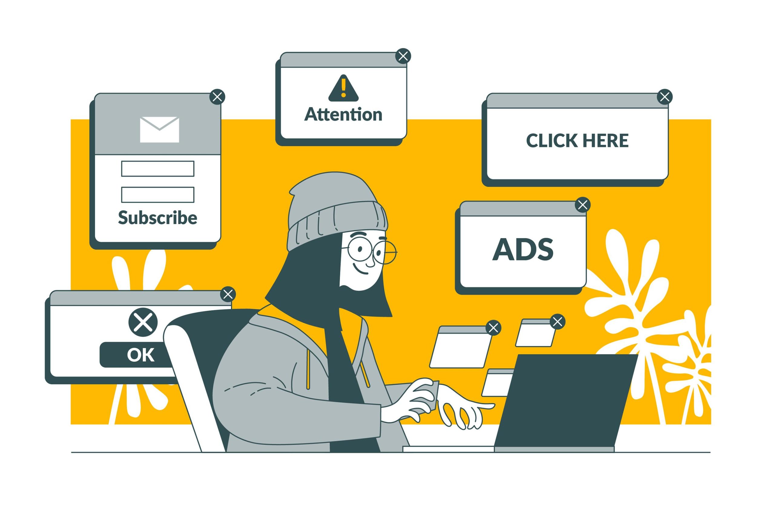
Don'ts in web design
- Overuse of animations: While animations and micro-interactions are important, you should avoid using too many animations that slow down the loading time of your website. Too much motion can also be distracting and detract from usability. They can simply distract from your goal; scoring a conversion and then, unfortunately, you have lost a visitor (and potential customer).
- Complex navigation design: Avoid complicated navigation patterns that may confuse users. Make sure the navigation is intuitive and easy to understand so that visitors find what they are looking for quickly. Think of endless submenus, too many click-throughs and (too) deep pages that are not easy to reach.
- Too much text on one page: Don't overload your web pages with long chunks of text. Users usually scan the content, so make use of short paragraphs, bullet points, sub-headings and visual elements to make the content easy to read and manageable.In this, also try to make the area of the content narrower. The ideal column width is somewhere between 50 to 75 lines. With a narrower plane, sentences automatically become 'shorter'. Also think about the line spacing, setting it a bit larger will make your text suddenly much clearer.
- Insufficient contrast: Make sure there is sufficient contrast between the text and background colours to improve readability. Poor contrast can make it difficult for people to read your website content, especially those with impaired vision.
- Launch untested designs: Before launching your website, make sure you run extensive tests on different devices and browsers to make sure everything works properly. It is important to fix any bugs, errors or compatibility issues before visitors interact with them.
- Long load times: Slow load times can lead to user frustration and cause a poor user experience. This can be due to large file sizes, unoptimised images, overuse of scripts or insufficient server performance. It is important to optimise your website's load times by compressing files, using caching and optimising images.
- Missing user feedback: The lack of clear feedback for users can lead to uncertainty and confusion. Users want to know if an action was completed successfully, if errors occurred and what the next steps are. It is important to build in feedback mechanisms, such as notifications, error messages and confirmations, to inform users of the status and progress of their interactions with the website.A perfect example of this is a contact form; you filled in 'something' incorrectly, but you get no feedback. No hint as to which field was filled in incorrectly or what the website expects from you so you can fix the mistake.... very frustrating of course!
A strong website design is more than just a pretty picture, it is the basis of online growth. Do you want a website that not only looks good, but also really performs? Then take a look at our web development page for more information on how we make your website work for your goals.
Or take contact with us to spar together on a web design that gets results.